Skillshare Class #3: Creating a Standout Visual Resume
/(This is a re-post from an article I originally published on Medium)
Moving Beyond the Traditional Résumé

My latest class on Skillshare is all about creating a visual résumé. There are several reasons I decided to create this course, which I will explain in this article. First I want to emphasize what the course IS and IS NOT.
The course is:
- An introduction drawing data as a tool for visual thinking and self examination
- An exploration of new and different ways we can talk about ourselves and tell our stories
- A series of fast and fun mental exercises to get your creative juices flowing
The course is NOT:
- A guide to using visual résumé template generators
- A detailed, step-by-step guide to creating detailed charts in data visualization software
- The universal source of truth for all job seekers
So, Why Visual Résumés?
I first got the idea for this class after Josh Tapley tweeted out to a group of data visualization professionals asking if they had examples of visual resumes. He used a data doodle of mine as an example, and at the time it was not something that I considered a “résumé”.
I initially created this visual (and several others) in preparation for a talk I was giving at a local data viz meetup to explain what I was doing with my new business, but why shouldn’t I call it a résumé?
After thinking about it, I realized that drawing a story like this could be a very useful exercise for all kinds of people, not just those of us working in highly visual fields. I have found tremendous value in the act of drawing data, and have been seeking ways to share the benefits with others, and a visual résumé course felt like the perfect opportunity.
Here’s Why:
1. You don’t have to be looking for a job, you might just need help telling a story
“Résumé” might even be the wrong word, because in my class we are really focused on creating basic charts that tell a visual story. I have created many different charts that tell many different stories to different audiences, from myself, to my boss, to auditoriums full of people. At first I didn’t consider any of these a résumé, but then I realized they served a very similar purpose.
I first started creating these types of charts when I was a data viz designer at Deloitte Consulting. Throughout my time at the firm, I participated in at least 4 mandatory trainings focused on helping us craft and communicate our personal brands. The goal was to come up with a concise elevator pitch to tell your story and your value, but it was such a struggle for me! My story never really resonated until I decided to try drawing it out. I found that when I used simple diagrams to explain a situation/circumstance, people were able to
- Understand what I was saying much quicker
- Remember my message better
- Be more inspired to take action (if necessary)

Example: After showing my boss a chart that illustrates team growth without investing in proper training the quality of our product was decreasing, he was immediately open to a discussion about improving onboarding.
2. You have seemingly endless amounts of data to work with
Nobody can be accurately summarized just by a job title- there are so many other important aspects that make up who you are. We know ourselves better than any other subject, and have unlimited potential to unwrap the complexities of our own personalities and experiences.
When you use this information to draw data that you know to be true about yourself, you will learn new things in the process. Visualizing seemingly separate aspects of our lives on the same page allows us to see how everything is in fact, related.
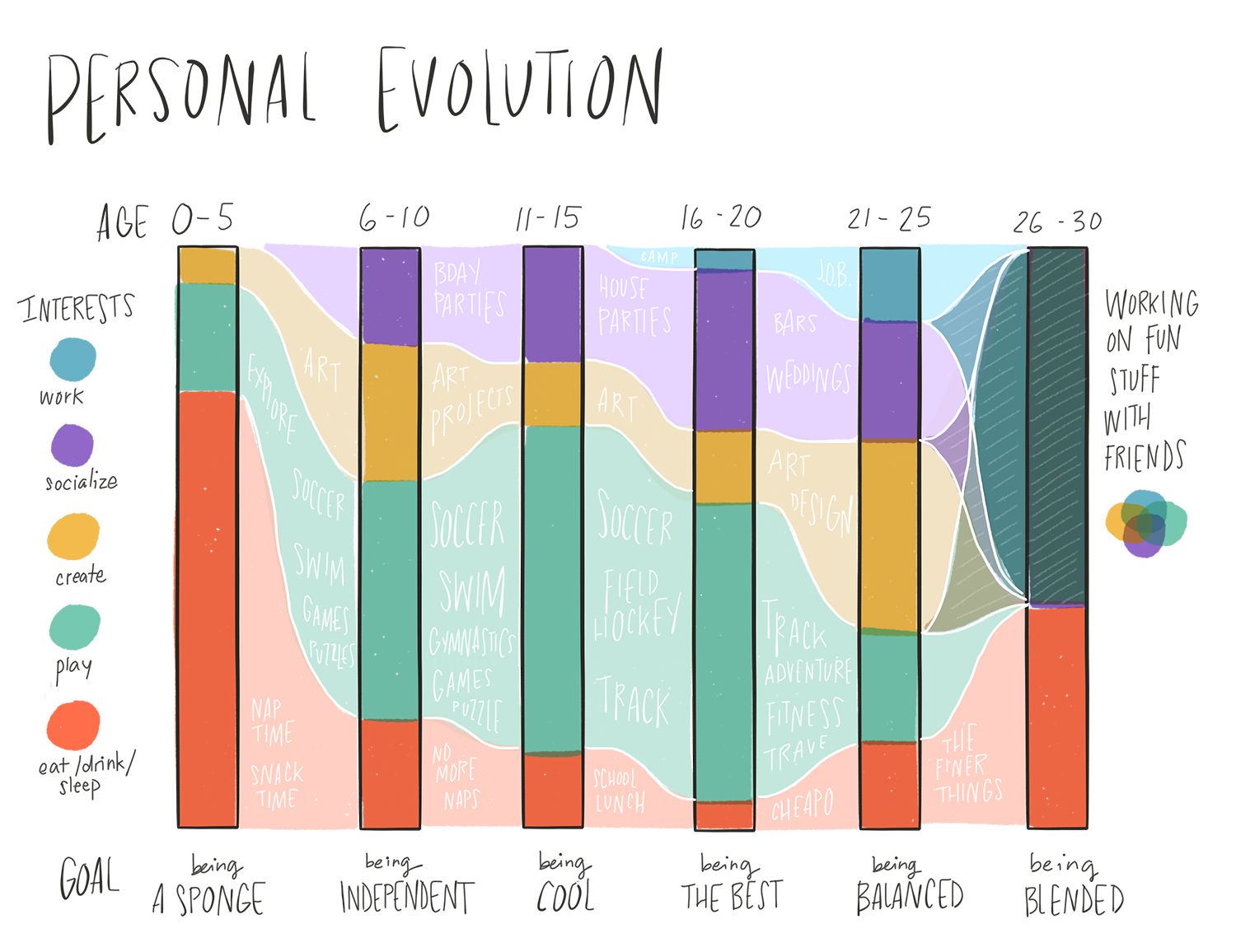
Example: Throughout my life and until recently I have always felt like I had multiple competing personalities. When I examined how each self-identity has changed over time, I realized how it came to be that I feel more balanced than before
3. A résumé should be focused on more than just checking boxes
At the inaugural DC Data+Women event, I was surprised to hear so many women share that they wouldn’t even consider applying for jobs that they don’t feel qualified for, just because they don’t check one of the required boxes (either minimum years of experience, aptitude with certain software, etc). But the reality is in most cases those are just guidelines and not make-or-break requirements.
You have so much more to offer than the number of years you have been coding in Javascript. What really says something is how and why you learned a certain skill….did you have the initiative and self-discipline to put in several hours every night learning it on the side? Or did your parents force you to study software engineering because they thought it would have the best job prospects? (Helpful hint: if you are in the latter category, might be best to come up with a better story than that…)

Example: One of my favorite draft ideas in the class is a chart that shows the skills I have and tools I know how to use on a grid comparing my actual experience to my desire to learn more. This feels like a much more informative way to show your aptitude than simply filling in a bar to represent an arbitrary percentage.
4. Most résumés are incredibly boring (even ones I have seen from visual designers)
It is impossible to truly communicate your unique value and fit with an organization on an 8.5 x 11" black and white PDF. If you are applying to a job online, you will still need to submit one for legal and technical reasons, but it should only be a starting point that leads people to a deeper and more informative place that describes you. And depending on the job you are seeking, you might still be able to get a little creative on the traditional resume format.
I have reviewed hundreds of boring UX/UI designer résumés, and feel obliged to point something out to this group: you can tell right away when someone has phoned it in, either by using a visual resume template or by focusing too much on the visual appeal and not enough on the content.

Example: These are two old versions of a slightly more “traditional” resume. I really don’t like either — what the left side lacks in visual appeal, the right side lacks in rich content. I hope I never have to use a traditional resume again!
What’s Next?
I sincerely hope that the class shows people a new way of understanding and sharing their personal journeys, and that they have some fun in the process. I am really excited to see what kinds of charts and visuals my students come up with. You can check them out on the class project page.
I’m also planning to launch a series of in-person workshops to build on some of the ideas and help people come away with something tangible. The first workshop will take place early next month, with 25 rising DCPS sixth graders in partnership with MAGA Design and Higher Achievement. I can’t wait to share the results!